|
New Interface & Logo
|
|
| DoctorOfSpace | Date: Sunday, 06.07.2014, 02:27 | Message # 31 |
 Galaxy Architect
Group: Global Moderators
 Pirate
Messages: 3600
Status: Offline
| Thats about what I was imagining would make it look nicer. I like that one. Perhaps the "SE" could be fixed up a bit.
Intel Core i7-5820K 4.2GHz 6-Core Processor
G.Skill Ripjaws V Series 32GB (4 x 8GB) DDR4-2400 Memory
EVGA GTX 980 Ti SC 6GB
|
| |
| |
| AthaxDesigns | Date: Sunday, 06.07.2014, 02:53 | Message # 32 |
 Observer
Group: Newbies
 Denmark
Messages: 2
Status: Offline
| Quote DoctorOfSpace (  ) Thats about what I was imagining would make it look nicer. I like that one. Perhaps the "SE" could be fixed up a bit.
Thanks, Hmm what do you mean by Fix it up a bit, could you elaborate yourself a bit more?
Edit:
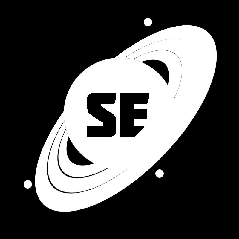
Idk if this makes any difference to you guys but i tried to make the gas giant appear more round.

More details and darker: 
Edited by AthaxDesigns - Sunday, 06.07.2014, 14:14 |
| |
| |
| DoctorOfSpace | Date: Sunday, 06.07.2014, 02:54 | Message # 33 |
|
Galaxy Architect
Group: Global Moderators
Pirate
Messages: 3600
Status: Offline
| Maybe white or blue color, something to contrast the planet better.
Intel Core i7-5820K 4.2GHz 6-Core Processor
G.Skill Ripjaws V Series 32GB (4 x 8GB) DDR4-2400 Memory
EVGA GTX 980 Ti SC 6GB
|
| |
| |
| SpaceEngineer | Date: Sunday, 06.07.2014, 09:43 | Message # 34 |
 Author of Space Engine
Group: Administrators
 Russian Federation
Messages: 4800
Status: Offline
| And shadows must be strengthened, they are almost invisible.
|
| |
| |
| RockoRocks | Date: Sunday, 06.07.2014, 10:45 | Message # 35 |
 World Builder
Group: Users
 Belgium
Messages: 674
Status: Offline
| That reminds me of the Celestia icon
I will be inactive on this forum for the time being. Might come back eventually
AMD AR-3305M APU w/ Radeon HD 1.90 GHz 6,00 GB RAM
|
| |
| |
| SolarLiner | Date: Sunday, 06.07.2014, 13:28 | Message # 36 |
 Explorer
Group: Users
 France
Messages: 267
Status: Offline
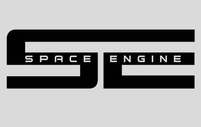
| I think blue should be used as primary color as the old SE logo is blue, and the default UI are all blue.
I played up a bit with your logo and my ideas, and came up with this:

And this:

I started with the orangey rings color, before reverting back to the blue color, but I finally kept the two because it might look good to you. Those are just my ideas 
custom landing page to share: http://bit.ly/spaceengine
|
| |
| |
| Proteus | Date: Sunday, 06.07.2014, 14:51 | Message # 37 |
|
Explorer
Group: Users
 United States
Messages: 173
Status: Offline
| Playing around in Photoshop with the "SE" logo shaping, maybe you'll like it to use collaboratively with the planet or another element.

Can always transfer it to vector if needed.
Just a sample using the silhouette version to give an idea of how it might work with it.

Edited by Proteus - Sunday, 06.07.2014, 15:56 |
| |
| |
| Pjj56 | Date: Sunday, 06.07.2014, 18:12 | Message # 38 |
 Observer
Group: Users
 United Kingdom
Messages: 14
Status: Offline
| Looks good  I tried cleaning it up a bit, not sure what colour the rings should be - Proteus, quite like your text I tried cleaning it up a bit, not sure what colour the rings should be - Proteus, quite like your text

System: Windows 10, i5 3570k OC @ 4.2GHz, AMD HD7850 (2GB VRAM), 16GB RAM
Edited by Pjj56 - Sunday, 06.07.2014, 19:36 |
| |
| |
| werdnaforever | Date: Sunday, 06.07.2014, 19:09 | Message # 39 |
 World Builder
Group: Users
Pirate
Messages: 897
Status: Offline
| AthaxDesigns, the "SE" text seems out of place, as if it was just laid on top of the logo rather than being an actual part of it. If the text was warped to fit within the circle, it would look much better. I created this quick example in photoshop:

It's not perfect, but this is what I'm talking about; find a way to warp the letters to neatly fit into a circle.
Also, the text should be larger so it fits within the entire circle. There should still be a border between the text and edge of the planet. Also: whatever you change, the E should still be identifiable as an E while overlapped by the ring; it shouldn't be too much of a problem though.
A logo needs to look good when reduced to it's simplest form; i.e. into exactly two colors like this:

Exaggerating the spacing between the rings would be a good idea.
Edited by werdnaforever - Sunday, 06.07.2014, 22:37 |
| |
| |
 ENG
ENG


 Pirate


 Denmark
 Russian Federation
 Belgium
 France
  United States
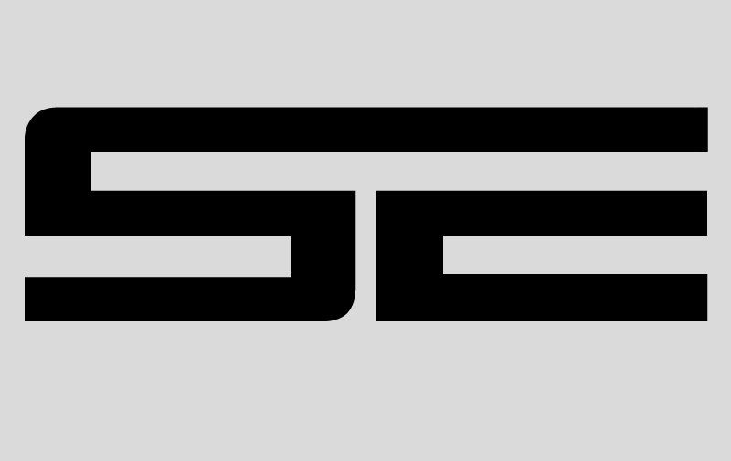


 United Kingdom